
How to Turn Google Forms Results into a Pie Chart
Fast navigation
Turning a Google Form into a pie chart is easy with the following 6 steps. Let us show you how to turn your Google Form into a pie chart.
Steps:
- Go to the "Responses" Tab
- Link Your Form to Google Sheets
- Prepare Your Data in Google Sheets
- Inserting the Pie Chart
- Customize Your Pie Chart
- Download or Share Your Pie Chart
Step 1: Go to the "Responses" Tab
Open your Google Form. At the top of the page, you'll find several tabs. Click on the ‘Responses’ tab to view all the submissions you've received.
Step 2: Link Your Form to Google Sheets
Look for a green spreadsheet icon labeled "View in Sheets" at the top right of the Responses section. Click on it.
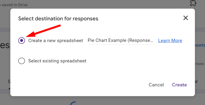
If it's your first time linking to Sheets, a prompt will ask you to create a new spreadsheet or select an existing one.
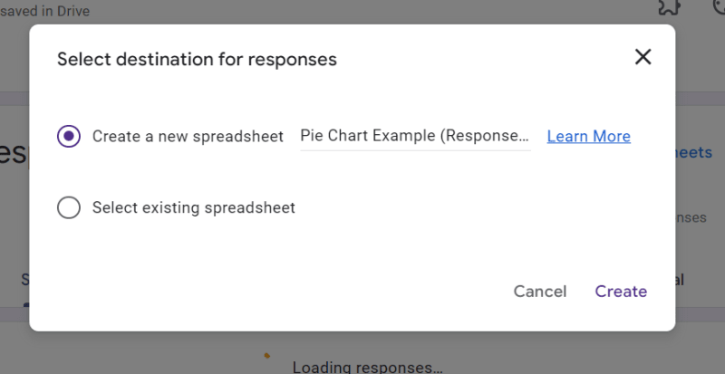
Choose "Create new spreadsheet" and it will open in a new tab.
The sheet will open in a few seconds in a new tab.
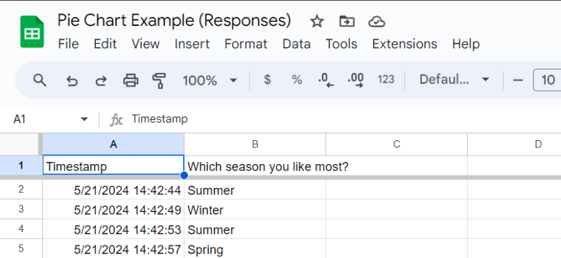
Step 3: Prepare Your Data in Google Sheets
In Google Sheets, locate the column with the question you want to analyze.
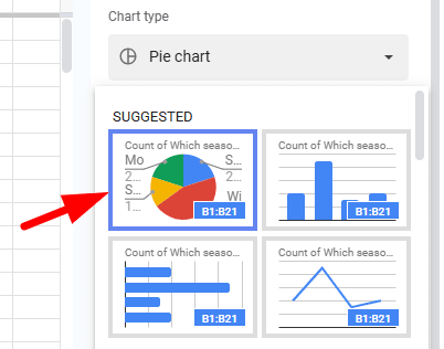
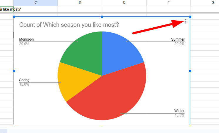
For our example, the question was "Which season do you like the most?"
Ensure you have all the responses in view.
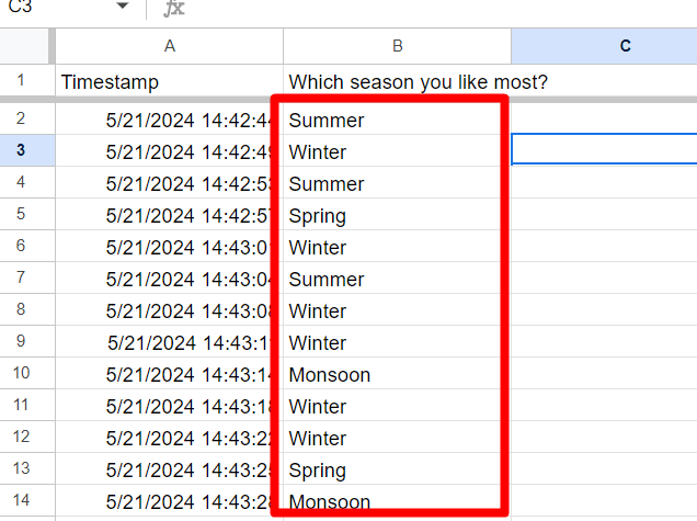
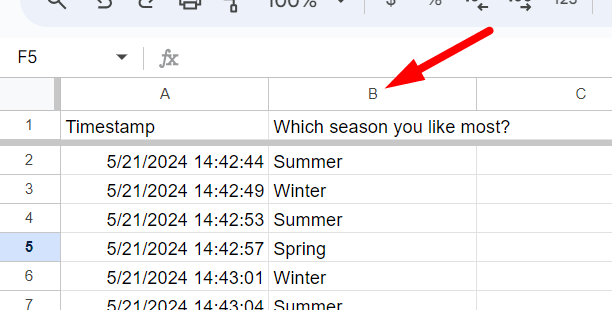
Click on the column header to highlight all the data for that question.
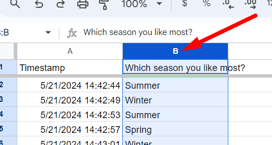
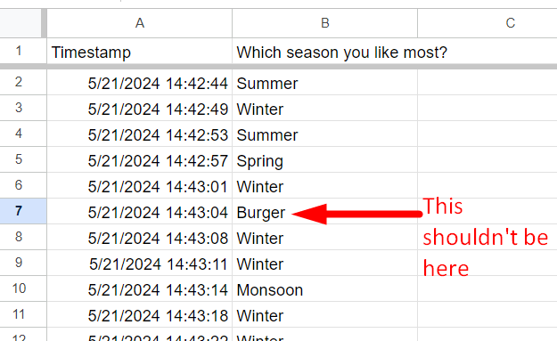
Ensure that the data does not include any irrelevant cells or titles.
Step 4: Inserting the Pie Chart
Go to the menu bar at the top and click "Insert".
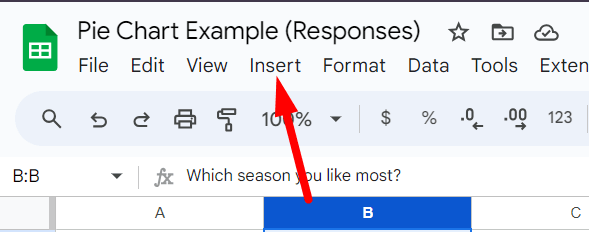
And then select "Chart".
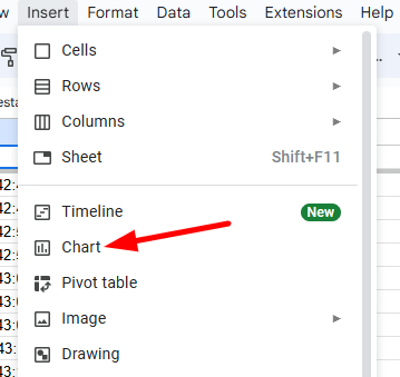
This will open the Chart Editor on the right side of your screen.
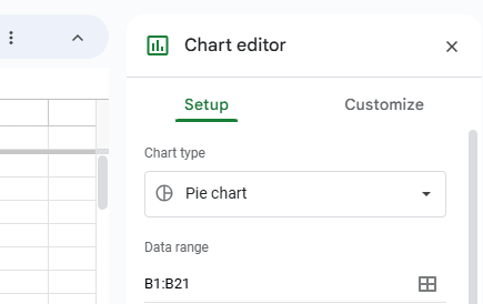
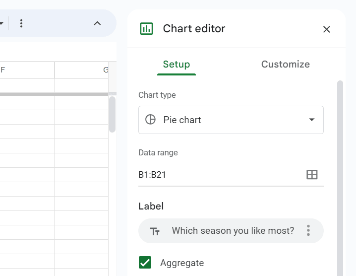
By default, Google Sheets will suggest a chart based on your data. However, you need to ensure it selects a Pie Chart.
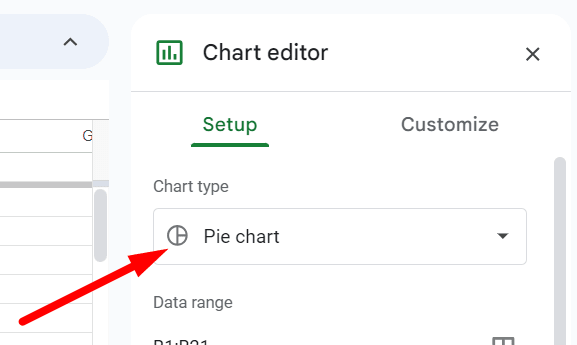
In the Chart Editor under the "Chart type" dropdown, scroll down and select "Pie chart".
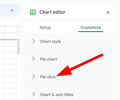
Step 5: Customize Your Pie Chart
With the pie chart selected, use the Chart Editor to make your chart more informative and visually appealing.
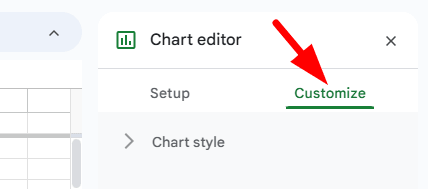
Click on "Customize" in the Chart Editor.
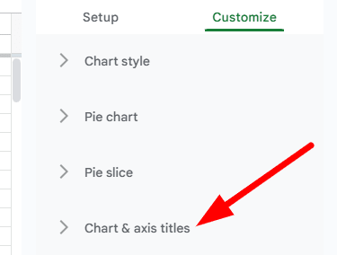
Modify the "Chart & axis titles" to add a descriptive title.
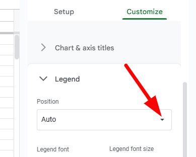
Change the "Legend" position to where it best fits the layout.
Adjust the "Slice label" settings to display the percentage or value labels on the chart.
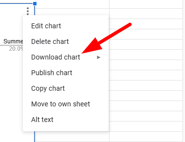
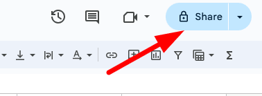
Step 6: Download or Share Your Pie Chart
When your chart looks perfect, you can either download it or share it:
To download, click on the three vertical dots on the upper-right corner of the chart.
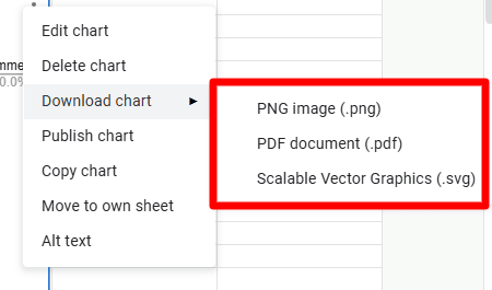
And select "Download".
Choose your preferred format (e.g., PNG, PDF).
To share, click the "Share" button in the upper-right corner of the Google Sheets window and set the sharing permissions as needed.
By following these detailed steps, you can turn your Google Forms responses into a detailed pie chart in Google Sheets.
This visual representation will not only make your data easier to digest but also more impactful when presenting it to others.
Finished!