
How to Make a Scatter Plot in Google Sheets
Fast navigation
In 5 easy steps, this guide will show you how to make a scatter plot in Google Sheets. Crafting insightful and visually appealing scatter plots is easy with Google Sheets' powerful charting features. Similar to creating a dot plot, which visualizes individual data points, scatter plots also allow you to explore relationships between variables effectively.
So let’s dive in and create a scatter plot in Google Sheets!
Steps:
1. Set Up Your Data in Google Sheets
2. Insert a Scatter Plot
3. Customize the Scatter Plot
4. Add Trendlines and Error Bars
5. Share and Collaborate
Step 1: Set Up Your Data in Google Sheets
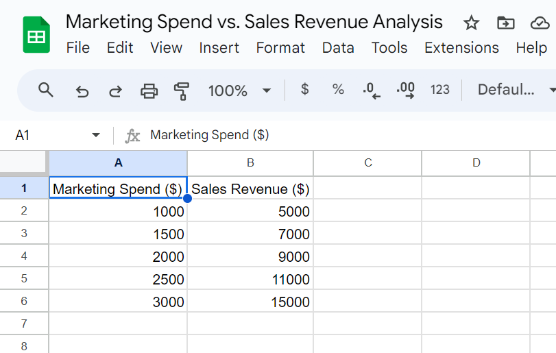
Before creating a scatter plot, ensure your data is properly formatted. You'll need two columns of data: one for the x-axis and one for the y-axis.
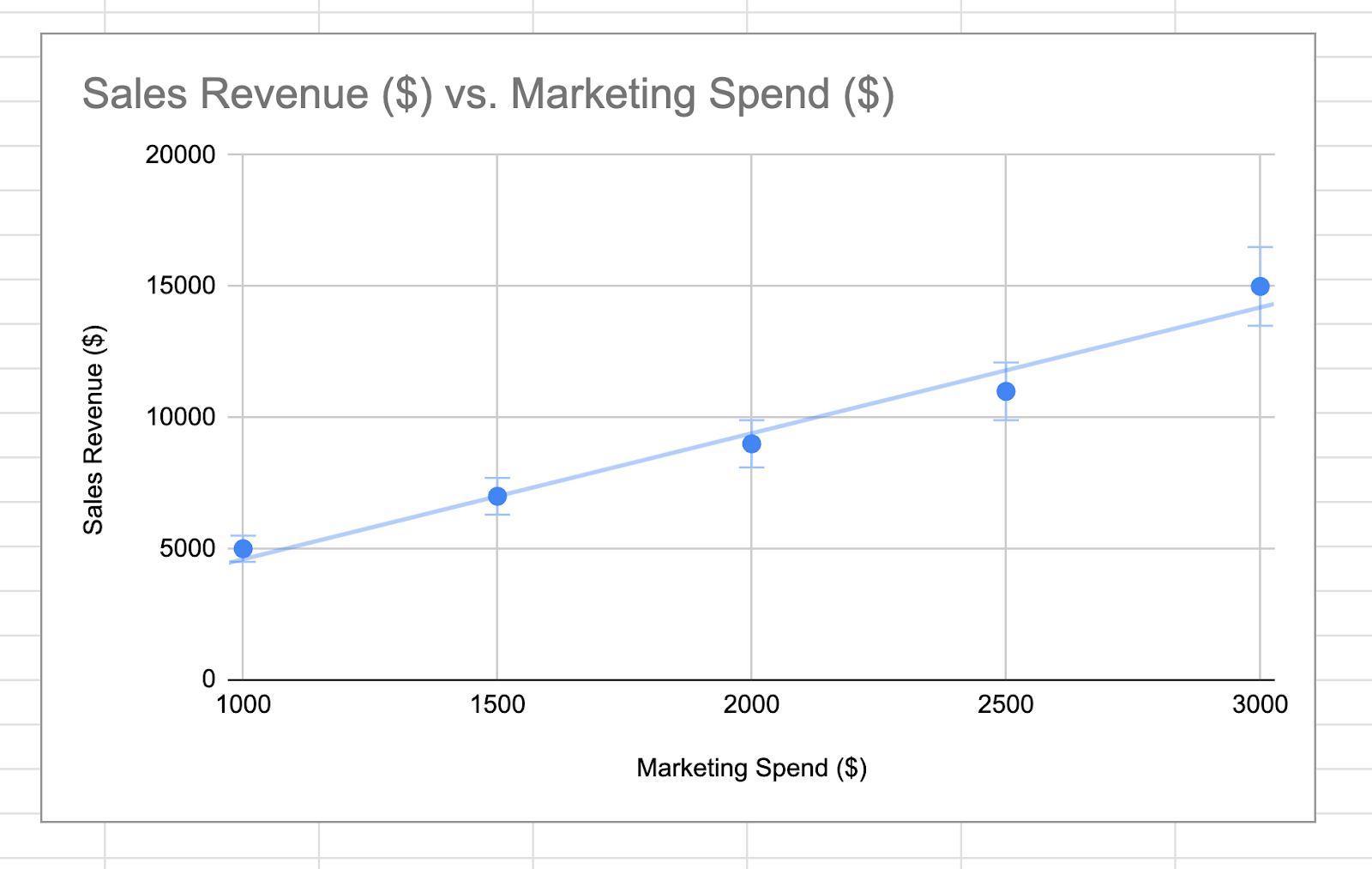
For example, let's use the following data set that correlates marketing spend with sales revenue.
Step 2: Insert a Scatter Plot
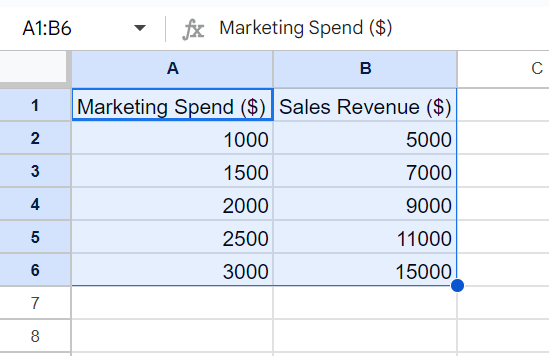
First, select both columns of your data, including the headers.
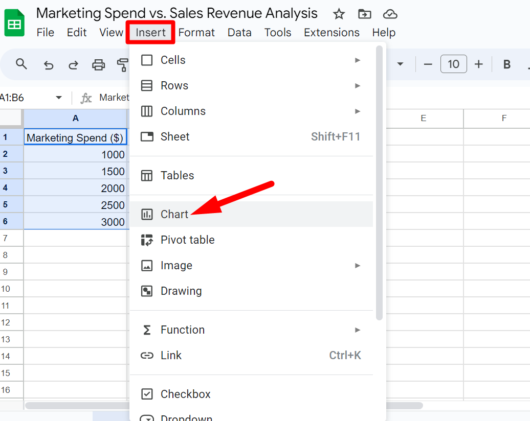
Click the Insert menu at the top of the screen and select ‘Chart’ from the drop-down list.
In the Chart Editor panel, click on the Chart type dropdown arrow.
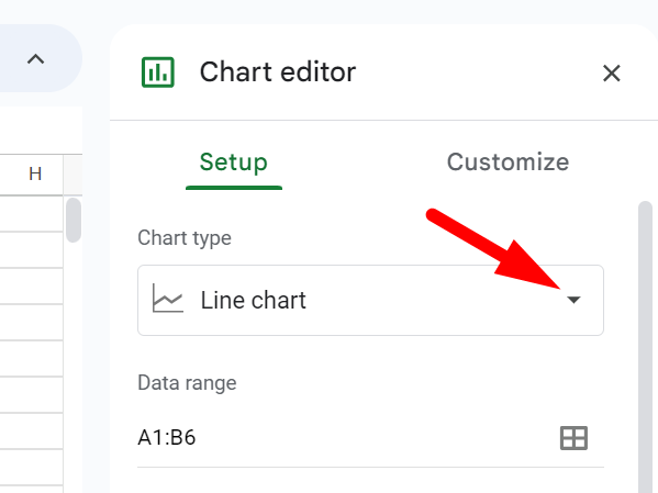
Choose the Scatter chart from the list of options.
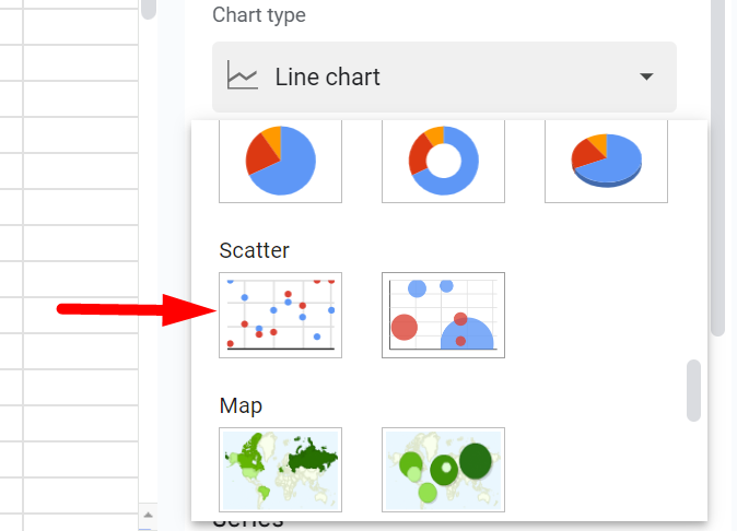
Your scatter plot should now appear on the sheet, displaying the data points according to the values you provided.
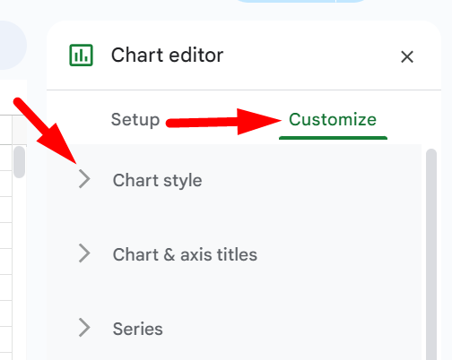
Step 3: Customize the Scatter Plot
Customizing your scatter plot can provide additional insights and clarity. The Chart Editor panel offers several options to modify the appearance and functionality of your scatter plot.
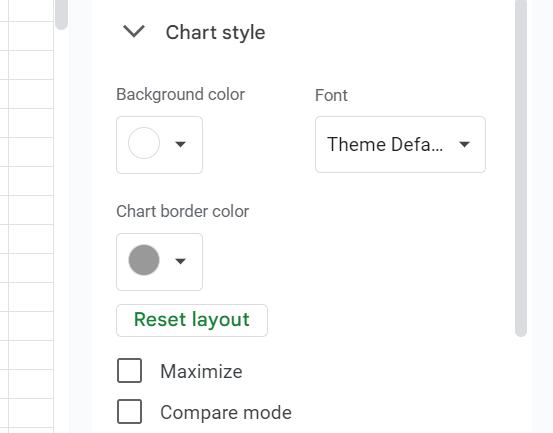
Go to ‘Customize’ and open “Chart style”.
Change the plot’s background color, font and overall appearance.
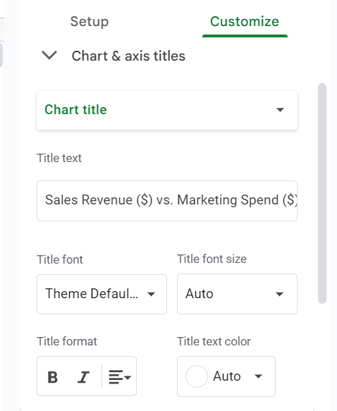
Again in the ‘Customize’ open “Chart & axis titles”.
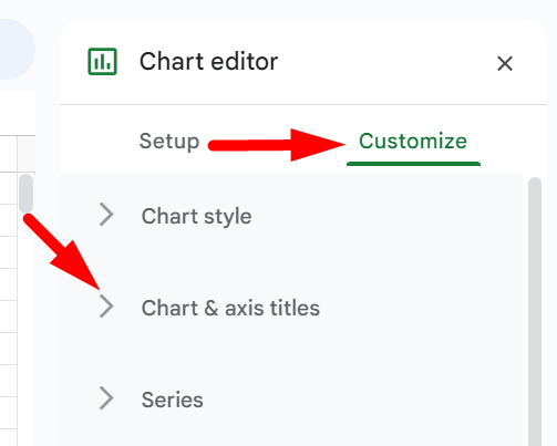
Edit the chart title, axis titles, and their respective styles (size, format, and color).
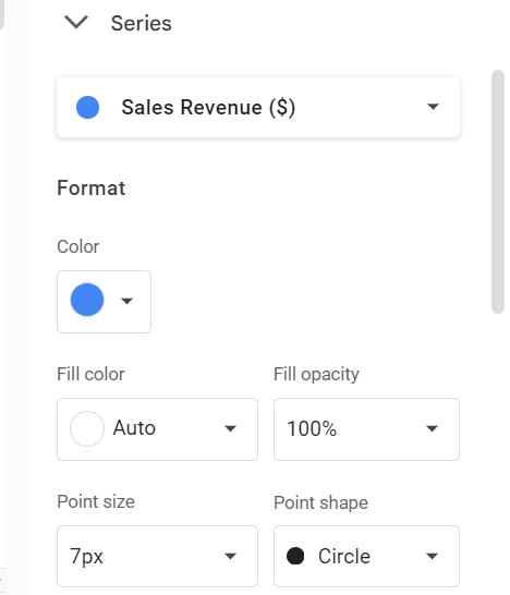
Now open ‘Series’, you can modify the point shape, size and color for each data series.
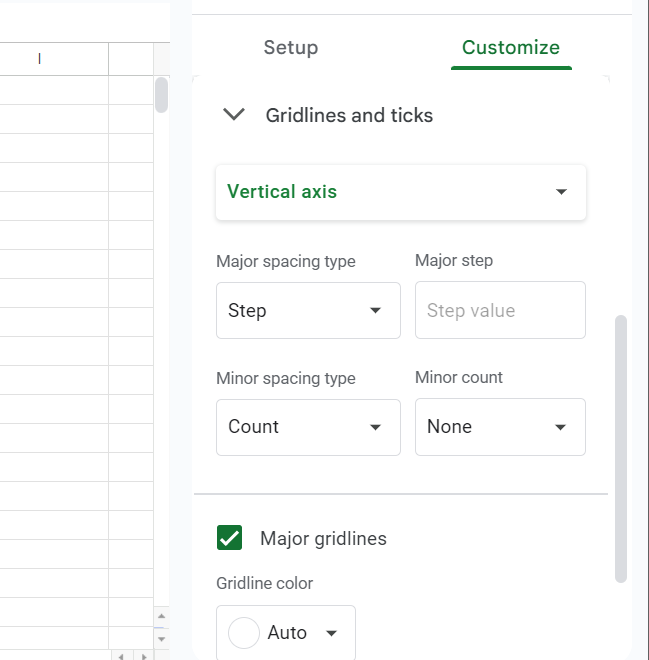
Go to Gridlines and ticks.
Adjust gridline colors and visibility for both axes.
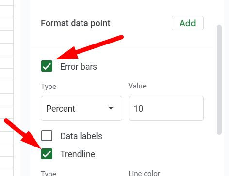
Step 4: Add Trendlines and Error Bars
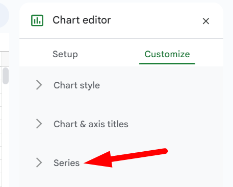
In the Chart Editor, go to Customize → Series.
Tick the checkbox of the Trendline box to add a trendline, which can help visualize the overall direction of the data. And you can also add error bars to represent the variability of the data.
And that’s how your scatter plot should look in Google Sheet.
Creating a scatter plot in Google Sheets is a powerful way to visualize and analyze data relationships.
By following these steps, you can create customized scatter plots that provide meaningful insights for your projects.