
How to Make a Dot Plot in Google Sheets
Fast navigation
In 4 easy steps, this guide will show you how to make a dot plot in Google Sheets.
Creating an informative and visually appealing dot plot is pretty simple.
So let’s dive in and make a dot plot on Google Sheets!
Steps:
- Organize Your Data
- Count Data Frequencies
- Insert a Scatter Chart
- Customize the Chart
Step 1: Organize Your Data
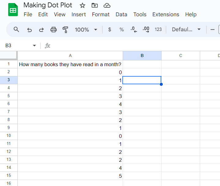
First, gather your data. For instance, you might have asked 14 individuals how many books they have read in a month, resulting in numerical data.
Enter your data in a column in Google Sheets. Let's say your data is in column A from A2 to A15.
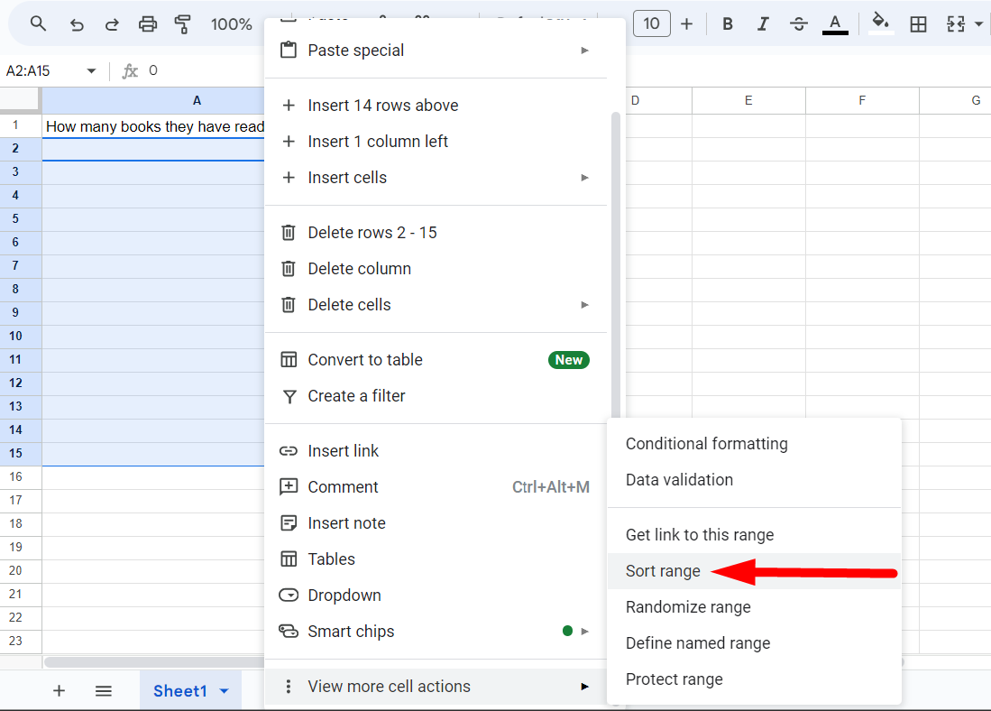
Highlight the data by clicking and dragging down from A2 to A15.

Right-click the selected range, scroll down, and select "Sort range" from A to Z. This organizes your data from least to most.
Step 2: Count Data Frequencies
Now, we need to count the occurrences of each number.
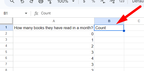
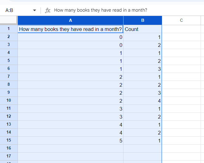
Create a new column next to your data and name it ‘Count’.
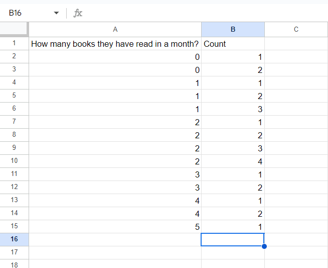
Manually count the frequency of each number and list it in the "Count" column.
For example:
0 appears 2 times.
1 appears 3 times.
2 appears 4 times.
3 appears 2 times.
4 appears 2 times.
5 appears 1 time.
Your sheet should look like this:
Step 3: Insert a Scatter Chart
Highlight the ‘Data’ and ‘Count’ columns (A and B).
Go to "Insert" from the menu, and select "Chart."
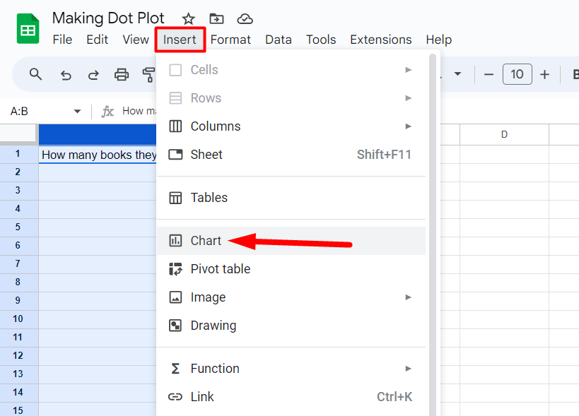
Google Sheets will insert a default chart.
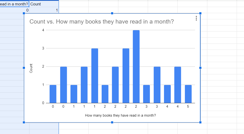
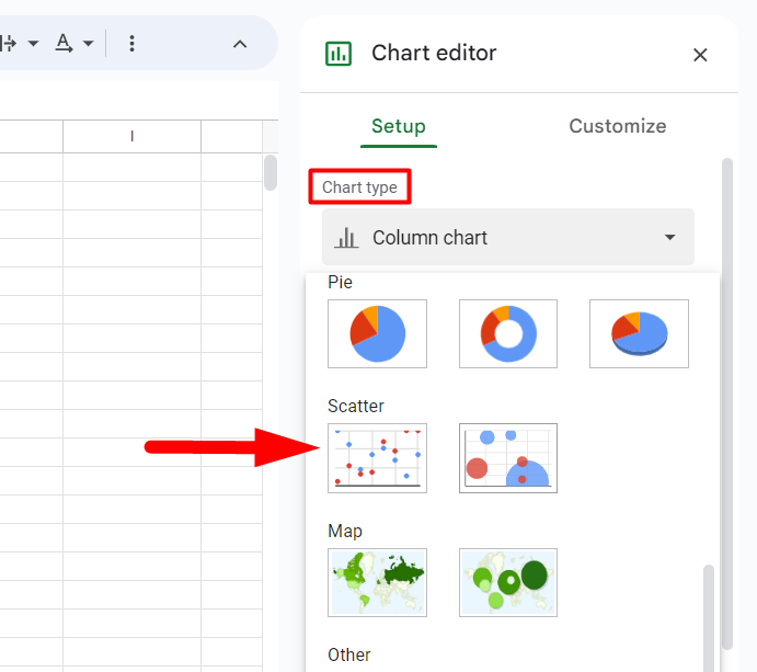
To make it a dot plot, change it to a scatter chart. You can do it on the Chart editor (on the right).
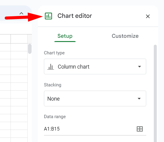
Under "Chart type", scroll down and select "Scatter chart".
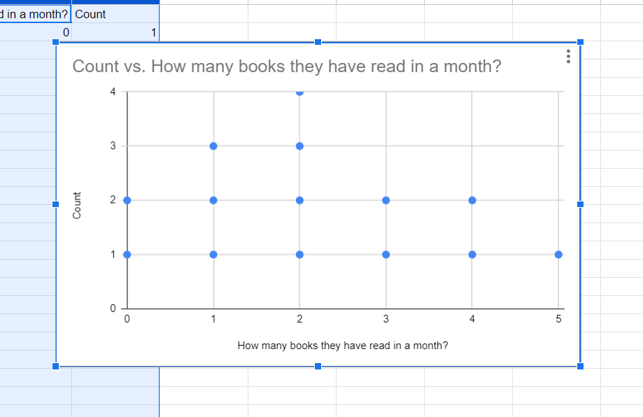
Now you can see the scatter chart with dots.
Step 4: Customize the Chart
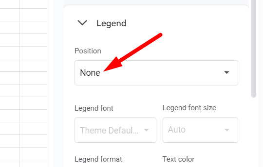
First, Remove the legend. In the Chart editor, go to the Customize section and click on ‘Legend’.

Set the position to ‘None’.
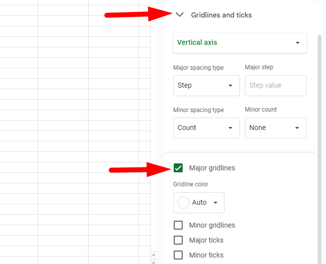
Then, adjust the gridlines and ticks. Click on "Gridlines and ticks".
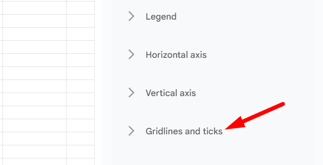
Ensure all options, including major gridlines, are unticked.
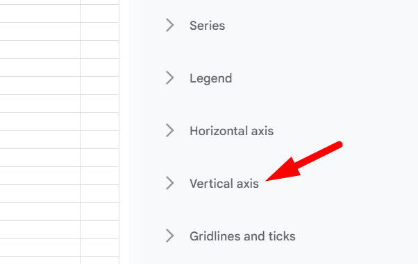
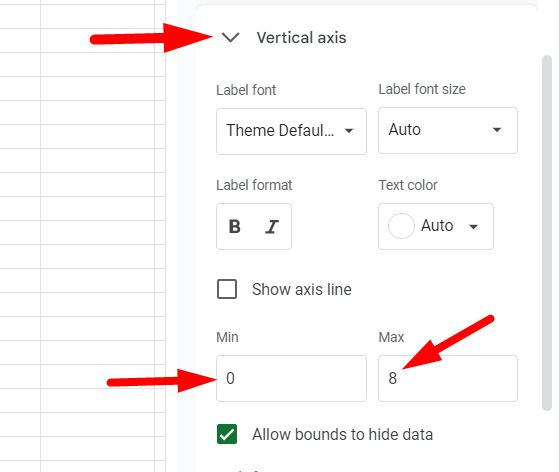
Now, customize the vertical axis.**** Click on the vertical axis.
Set the minimum value to 0 and the maximum value according to your number.
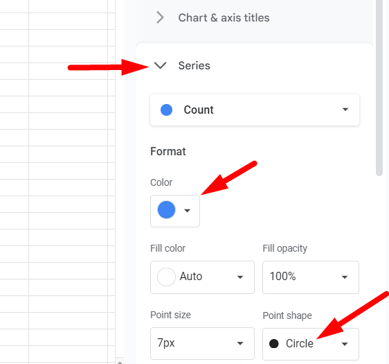
You can customize the appearance more.**** Change dot shapes under "Series" to circles, X marks, or pentagons. Adjust their size and color for better visibility.
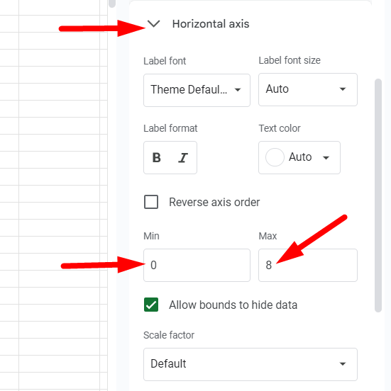
Adjust horizontal axis settings if needed. Set minimum and maximum values to give some leeway. Rename axis titles by clicking on them.
Customize the font, color, and other aspects to make the chart look more polished.
And that's how you create a dot plot in Google Sheets! With these steps, you can turn raw data into a clear, visually appealing dot plot that makes your data easy to understand.