How to Make a Pareto Chart in Google Sheets
Fast navigation
In 7 simple steps, this guide will show you how to make a Pareto chart in Google Sheets.
Visualizing the most significant factors in your dataset is straightforward with this method.
So let’s dive in and create a Pareto chart in Google Sheets!
Steps:
1. Collect and Prepare Your Data
2. Use the QUERY function to summarize and sort your data
3. Calculate Cumulative Frequency
4. Calculate Cumulative Percentage
5. Insert the Combo Chart
6. Customize the Chart
7. Interpret the Pareto Chart
Step 1: Collect and Prepare Your Data
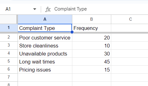
First, gather your data in a Google Sheet.
Suppose you manage a retail store and have collected data on customer complaints over the past month.
Your table might have two columns: “Complaint Type” and ‘Frequency’.
Step 2: Use the QUERY function to summarize and sort your data
Enter the following formula in a new cell (e.g., D1):
=QUERY(A1:B6, "select A, sum(B) where B is not null group by A order by sum(B) desc", 1)
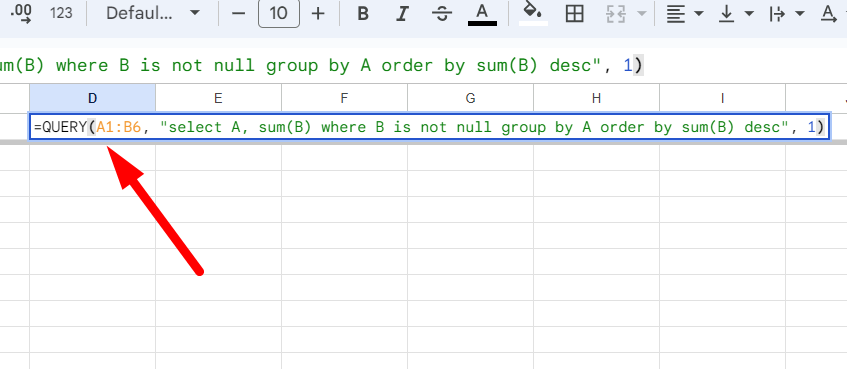
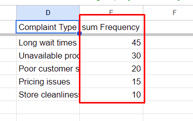
This formula groups complaints by type, sums up the frequencies, and sorts them in descending order.
Step 3: Calculate Cumulative Frequency
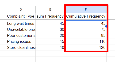
Next to your sorted data, calculate the cumulative frequency. In the first cell of the new column (e.g., F2), enter:
=SUM($E$2:E2)
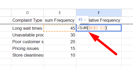
Drag this formula down to apply it to the rest of the column. This will give you the running total of complaint frequencies.
Step 4: Calculate Cumulative Percentage
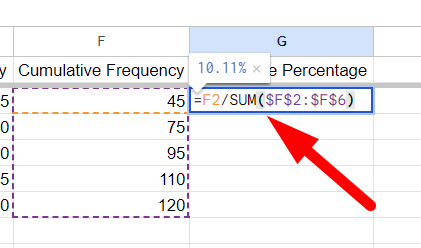
To calculate the cumulative percentage, add another column. In the first cell of this new column (e.g., G2), enter:
=F2/SUM($F$2:$F$6)
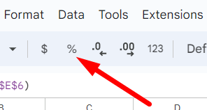
Format these cells as percentages by selecting them and clicking on the "Format as Percent" button in the toolbar or navigating to Format > Number > Percent.
Step 5: Insert the Combo Chart
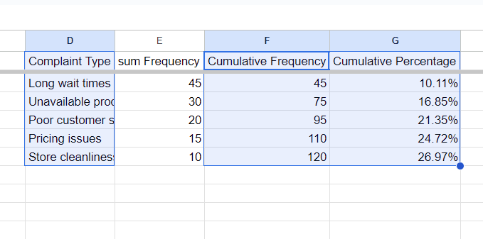
Now, it's time to create the Pareto chart. Highlight your data, including the “Complaint Type”, ‘Frequency’ and “Cumulative Percentage” columns.
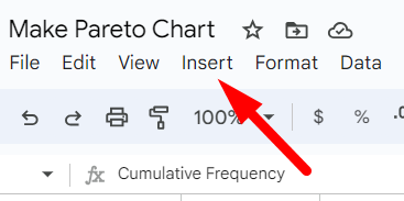
Click on ‘Insert’ from the top menu.
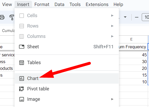
Select ‘Chart’.
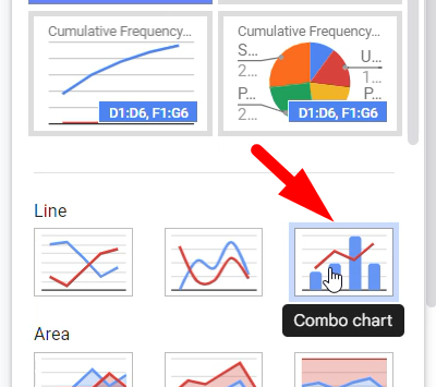
In the Chart Editor, change the Chart Type to “Combo Chart”.
Step 6: Customize the Chart
To enhance the readability of your chart, make some customizations:
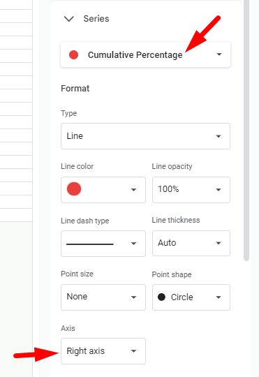
In the Chart Editor under the ‘Customize’ tab, adjust the ‘Series’ option.
Ensure the “Cumulative Percentage” data series is set to use the right axis.
This will display your frequencies as bars and the cumulative percentage as a line on the same chart.
For those who find visual data representation helpful, similar techniques can be used when learning how to create a heat map in Google Sheets, where color gradients can highlight patterns or outliers in your data.
Step 7: Interpret the Pareto Chart
Your Pareto chart is now ready! The complaints are ranked by frequency with a cumulative percentage line indicating the proportion of complaints accounted for as you move down the list.
This visual representation helps you identify the most frequent complaints and prioritize which issues to address first.
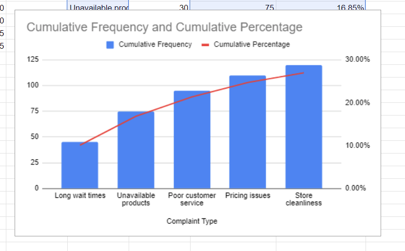
Creating a Pareto chart in Google Sheets is straightforward with these steps.
By visualizing your data in this manner, you can easily identify and focus on the most significant factors impacting your processes.
