
How to Create a Heat Map in Google Sheets (2 Methods)
Let us show you exactly how to create a heat map in Google Sheets in 2 different methods.
Whether you're a business analyst, a teacher, or just someone looking to make sense of data, a heat map can provide valuable insights at a glance.
So let’s dive in and create a heat map in Google Sheets!
2 Methods:
- Creating a Sequential Heat Map
- Creating a Geo Heat Map
Method 1: Creating a Sequential Heat Map
Sequential heat maps are ideal for highlighting variations in data values within a specific range. Follow the following steps to create one:
Step 1: Open Your Google Sheet
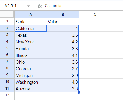
Go to Google Sheets and open the document containing your data set.
Ensure your data is organized with numerical values that you want to visualize.
Step 4: Apply Color Scale
In the Conditional Format Rules panel on the right, select the Color Scale tab.
Choose a color scale from the presets or customize the colors for minimum, midpoint, and maximum values.
Click Done to apply the color scale to your selected cells.
Now you can see the heat map.

Finished!
Method 2: Creating a Geo Heat Map
Geo heat maps visualize data geographically, ideal for showing regional data variations.
Step 1: Insert a Geo Chart
Highlight the cells containing your geographical data.
Click on Insert in the top menu. And select Chart from the dropdown menu.
On the right side you can see the “Chart editor”.
Click on the dropdown arrow to choose the chart type.
Choose Geo Chart from the menu.
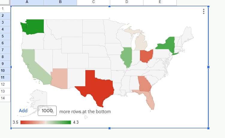
Now you can see the Geo chart.

Step 2: Customize Geo Chart
In the upper image you can see the chart shows the data in the world map. If you want you can set it for the specific region. For that, in the chart editor, click on ‘Customize’.
Open ‘Geo’, and click on the dropdown arrow under ‘Region’.
Set the region to your desired geographical area.
Customize colors and data ranges as needed.

Here is the heat map.
And that’s how you create various types of heat maps in Google Sheets!
By using these methods, you can transform your data into clear, insightful visualizations that highlight trends, outliers, and patterns.
Whether you're analyzing sales data, monitoring regional statistics, or exploring complex datasets, heat maps provide a powerful way to understand your information at a glance.
Finished!
